One of the more challenging parts of image capture can be getting something that looks like a faithful representation of the original. Many things can impact the actual capture and the perception of the finished item including lighting, software settings, and the settings and calibration of the monitor on which the object is viewed. Some of these are more easily controlled than others. As we work with a wide variety of items, and different equipment, each with its own image capture software — not to mention items that are delivered to us having been scanned off-site — we are constantly making adjustments.
We’re lucky to have someone on our team who is very knowledgeable about colour management from a technical perspective. He’s been able to help us, after the department purchased some software and some equipment, to start building colour profiles for each piece of equipment. What that means is that, to the best of the equipment’s abilities it is collecting and displaying as much colour information as possible.

While profiles work well for scanners, some tinkering on our side is still necessary when camera lenses are involved. It means things like focus and contrast may need to be adjusted depending on the material and depending on the amount of light being cast on the material, and the time the lens aperture is open. With our large-format scanner, this is controlled through the Betterlight software and normally takes just a few minutes of set up for each project.
One of the more challenging projects for colour management has been the ongoing collection of Chinese Propaganda Posters. In addition to being printed on very low-grade paper, and being in varying conditions, many of the posters add the challenge of having a lot of red areas. Red is difficult to capture because it is the smallest part of the spectrum. Combine that with a soft-contrast colour like yellow and you have the recipe for one of the bigger challenges we’ve faced.
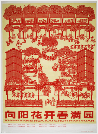 One of the posters we had to scan was one we called “sunflowers” (I am not able to read the Chinese characters so I file-name based on the subject matter of the poster as I do that work before the translations and descriptions are provided) which was entirely red artwork on a faded yellow background with just a bit of the newsprint-coloured paper showing around the edge.
After an entire afternoon trying to use the techniques we’d been shown and still failing to get anything that looked like a faithful reproduction, we cried uncle and put a call in to the technician who’d trained us on the software. His answer was that sometimes, you just have to “trust your gut” rather than the numbers on screen. So I built a new profile for that poster, fiddled a bit more, and eventually came out with a clear representation. In the end it took about 6 hours of staff time collectively just for one image capture. The finished poster which, translated, is called “Sunflowers bloom in the spring garden” is an accurate representation of the original.
What we learned from that one project has served us well on subsequent projects and as we continued to work with the propaganda posters. I now start with the sunflower profile I built when I am faced with any poster that has a lot of red and/or yellow and, more often than not, it is pretty close to the mark, saving me hours of fiddling.