
[et_pb_section fb_built=”1″ _builder_version=”3.22″][et_pb_row _builder_version=”3.25″ background_size=”initial” background_position=”top_left” background_repeat=”repeat”][et_pb_column type=”4_4″ _builder_version=”3.25″ custom_padding=”|||” custom_padding__hover=”|||”][et_pb_text _builder_version=”3.27.4″ background_size=”initial” background_position=”top_left” background_repeat=”repeat”]Here at the DSC, I’ve been working on a project that mixes book history and 19th-century illustration with 3D design and printing. This project grew out of my work as an MA student in the English department, where I took a course in Victorian fiction and illustration, taught by Dr. Lisa Surridge. We spent a lot of time in that class in Special Collections, looking at 2D illustrations and learning about the printing processes and techniques behind them. However, we never had the chance to see the illustration plates—the physical objects needed to print out the illustrations. We could only imagine them.
At the same time, I was also working in the MLab (directed by Dr. Jentery Sayers), where we remade old technologies with 21st-century tools. There, I learned about the cultural context and implications of technologies, as well as technical knowledge for prototyping devices.
All of this lead me to an interesting question: is it possible to take a 2D image of an illustration and reverse-engineer a 3D model of the printing plate? I wondered if I could learn more about print(mak)ing now (2018) or then (19th century) by thinking about it as a process that moves between digital and analog forms.
From 2D to 3D…
To create my model, I knew I would have to first vectorize the image. Images fall into two broad categories: raster and vector. Raster images—the kind you typically find online (.jpg, .png, etc.)—are made up of thousands of tiny pixels. By contrast, a vector image is composed of thin lines or “paths.” For 3D models and 3D printers, the far better choice is almost always a vector image: you can resize a vector image without losing the quality and the 3D-printed model will ultimately have much crisper, cleaner edges.

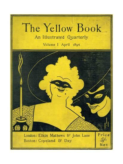
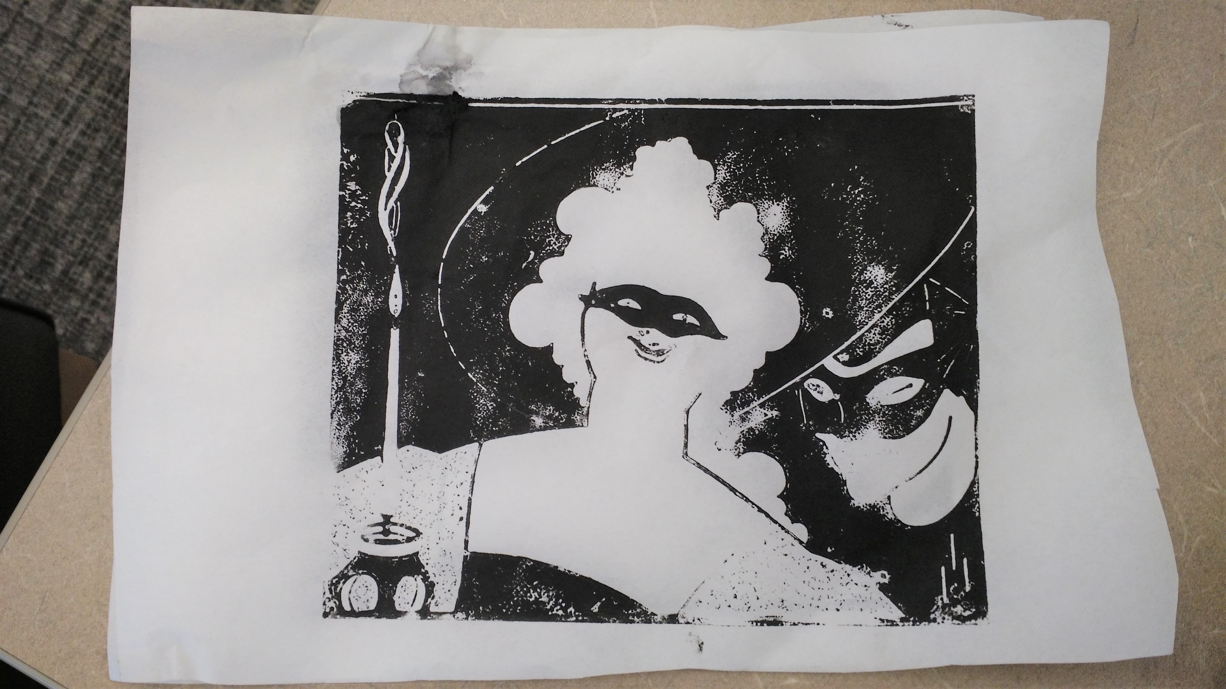
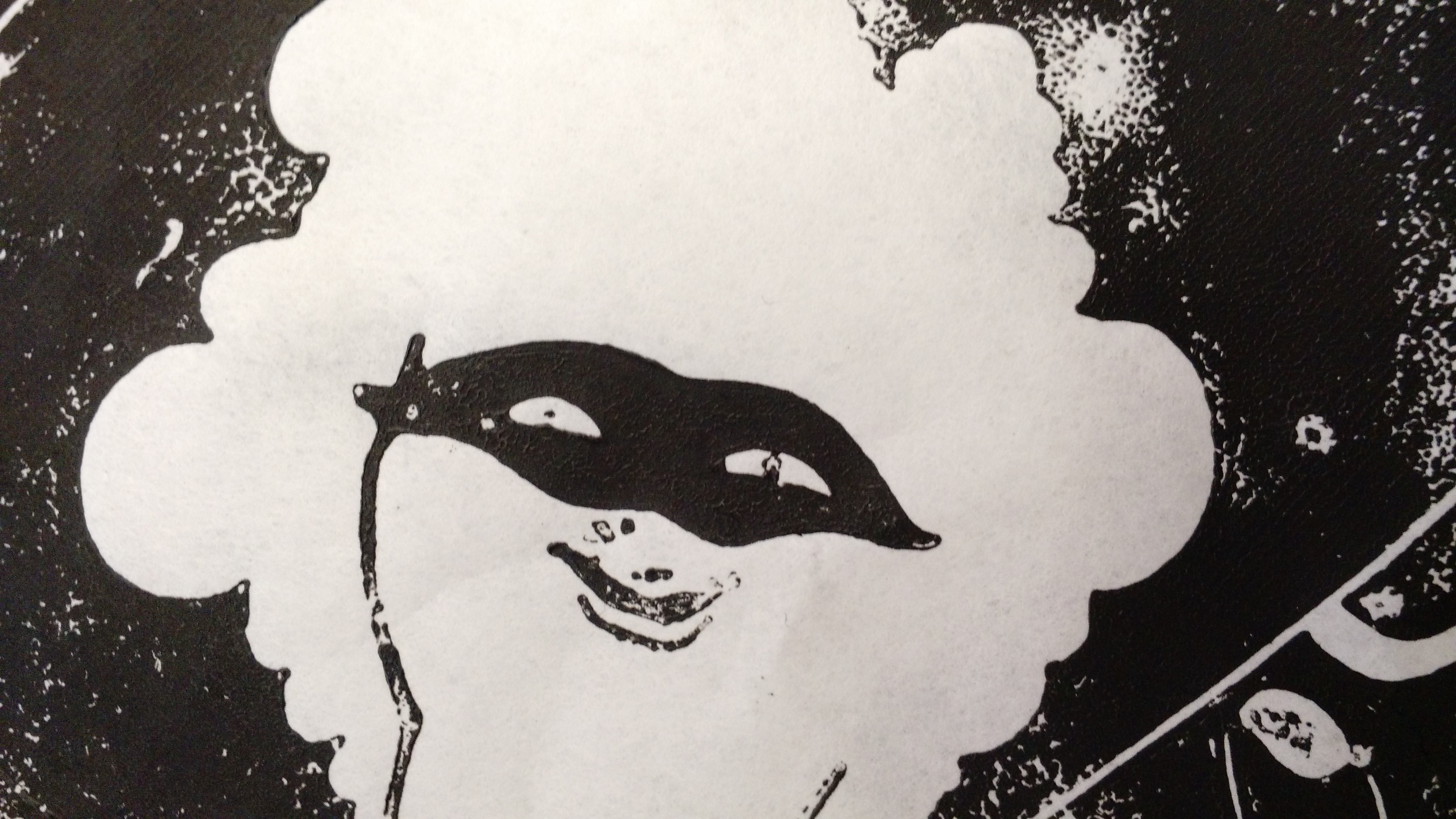
For my first experiment, I chose a .jpg file of a woodcut, known as “Masquerade,” which Aubrey Beardsley made in the 19th century. I specifically chose a woodcut because I thought that printing technique would produce a more persuasive model. (The decision to pick Beardsley was more arbitrary: I learned in class that he is well-known for his woodcuts.)

To explain why, let’s start with how computers detect edges in photos. When a computer looks for edges, it is really looking for areas or patterns of contrast (in terms of brightness or colour) that indicate a boundary between one thing (e.g. a face) and another. This is the principle behind facial or object recognition algorithms. (To learn how Snapchat uses this for its filters, see this excellent video by Vox.)
Woodcuts—among 19th-century illustration techniques—are ideal for this. Woodcuts are made by carving lines or recesses out of wood. If the wood block is inked in black, then the recessed areas come out white on the final print while the other remaining areas come out black. From left to right, the print will also be reversed. This printing process means that woodcut prints have areas of strong contrast: a space can be white or black, without any shades of grey that might confuse image-detection software. (Technically, one can make an area seem grey with hatching or other carving techniques, but I digress.)

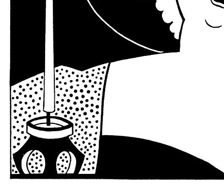
To return to the image of Aubrey Beardsley’s woodcut, I thought it would make an interesting test case because the lines are sparse and sometimes very thin—a characteristic that I thought would test the 3D printer’s limits. I also chose it for the dots on the woman’s dress, which I also thought would be a challenge for the 3D printer.
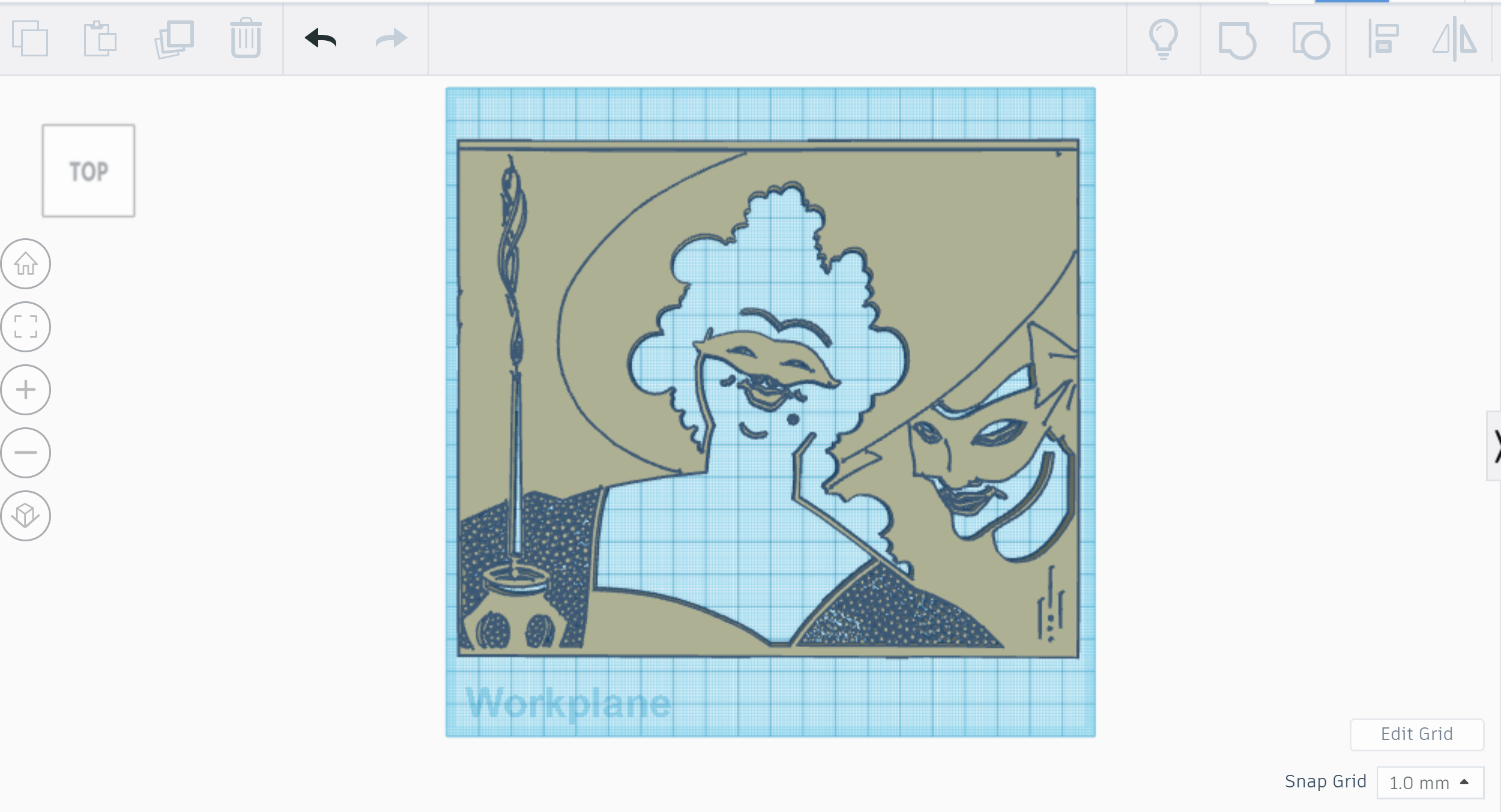
I used Inkscape, a free and open source image editor, to vectorize the image (see tutorials here and here). In terms of specific settings in Inkscape, I would suggest a threshold of about 0.5 and fewer scans if possible (2-5). You may have to experiment with the settings to get the results you want.
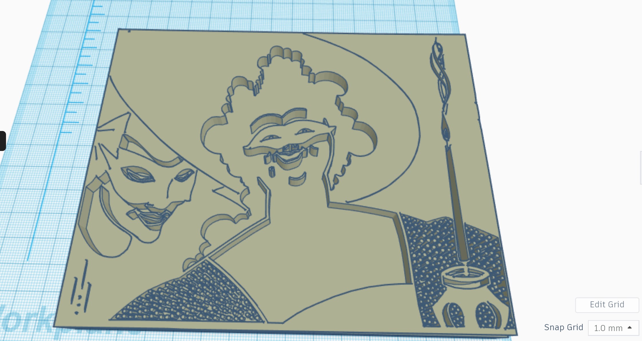
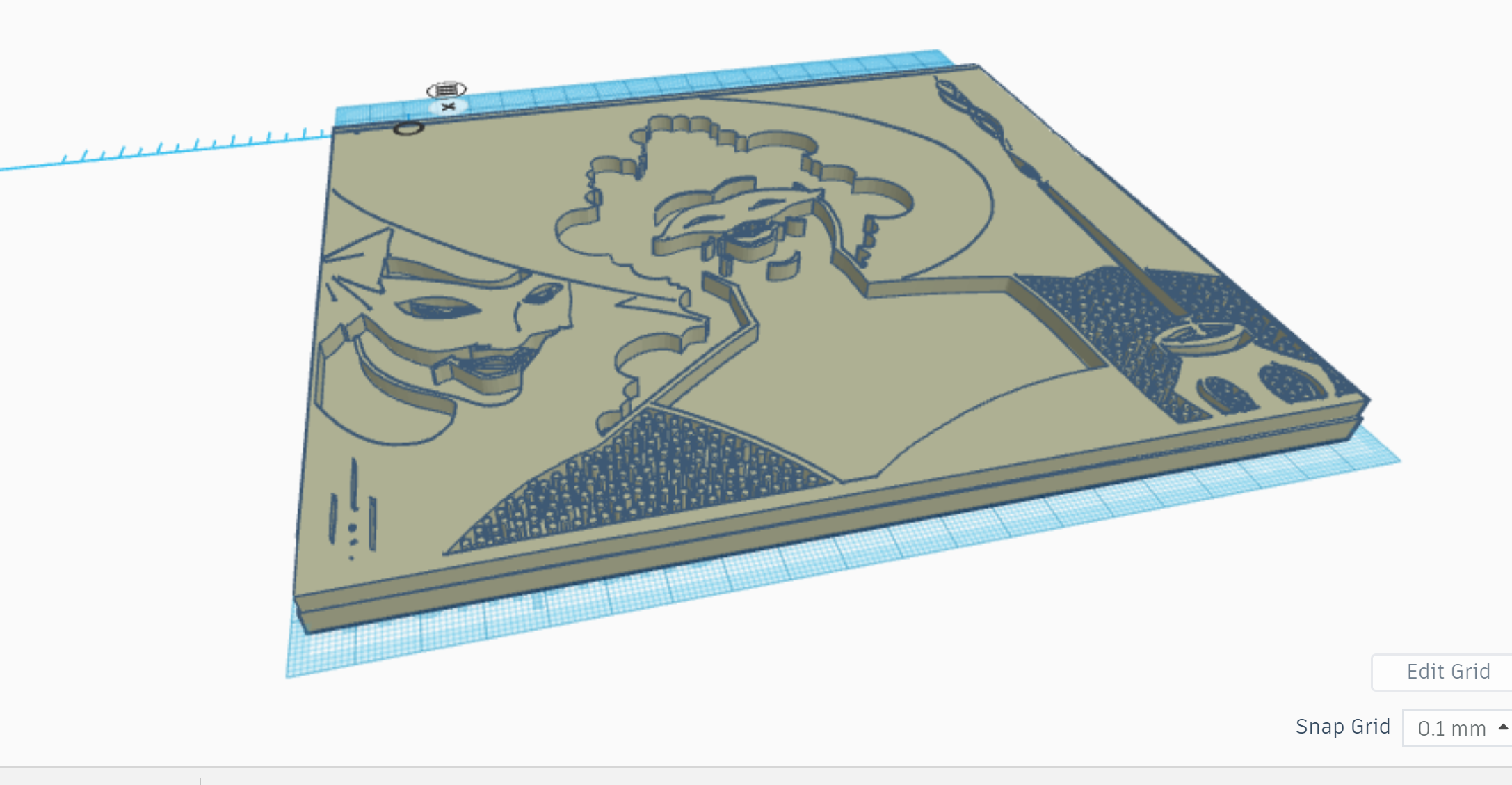
After vectorizing the image, I opened up TinkerCad (free 3D design software) and imported the .svg file. Then I made a wide block, about a centimetre thick, for the base and plopped the image on top.
…and Back to 2D
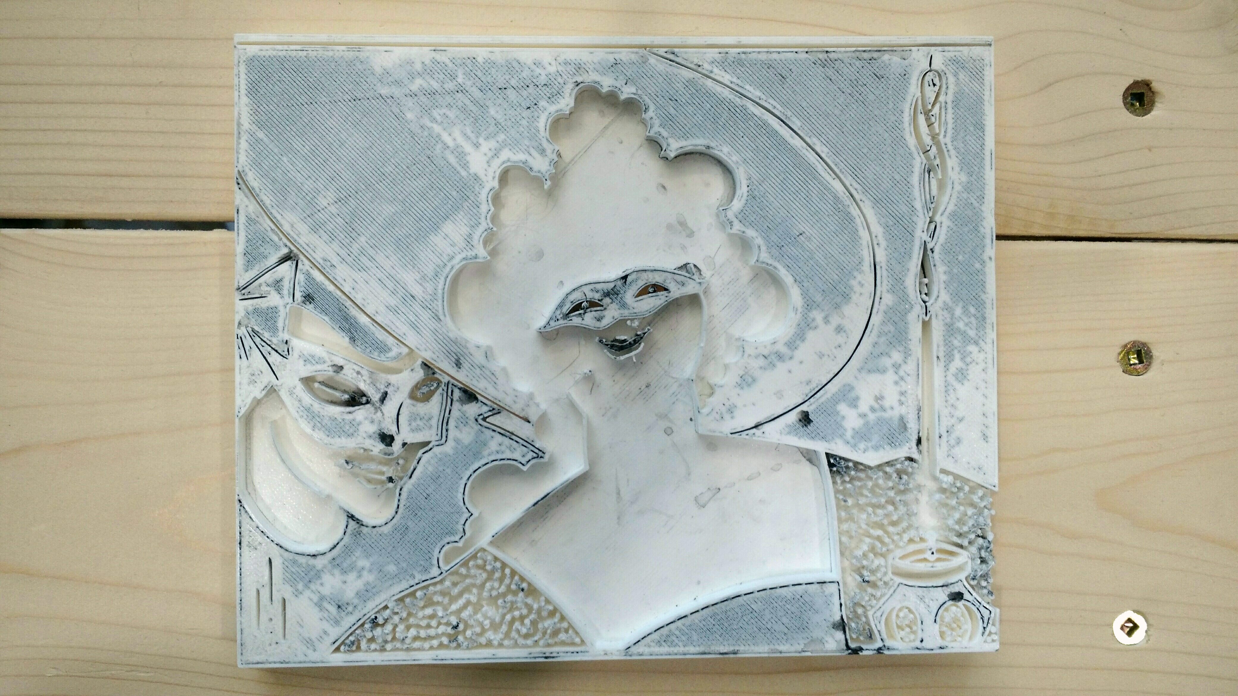
After designing the model, I used MarkerBot Print and the DSC’s Ultimaker to print it. The model took about 19 hours to print. The 3D model came out okay overall but a lot of the finer lines and details didn’t come out very well. Predictably, these details didn’t come out well in the resulting prints.
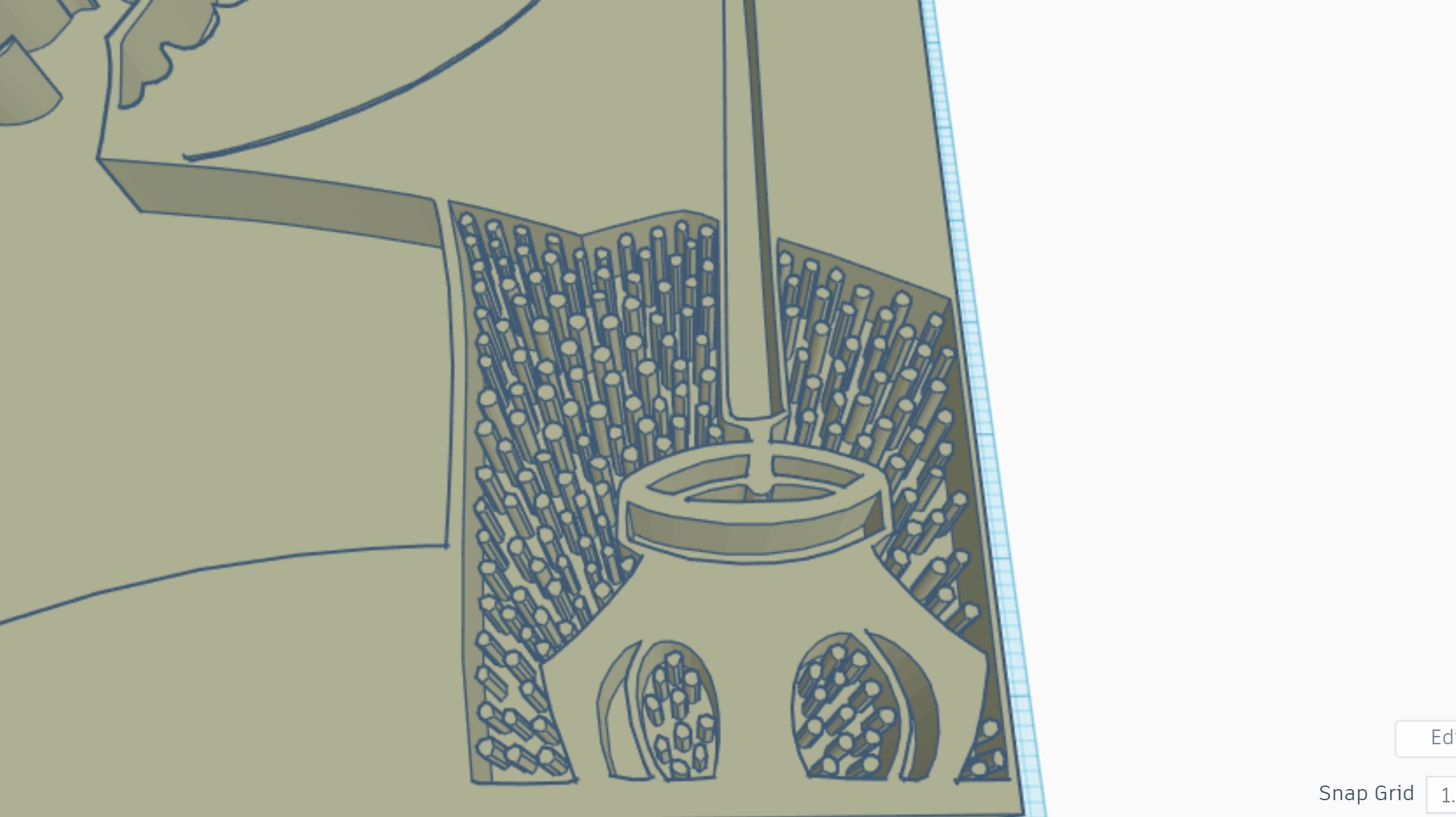
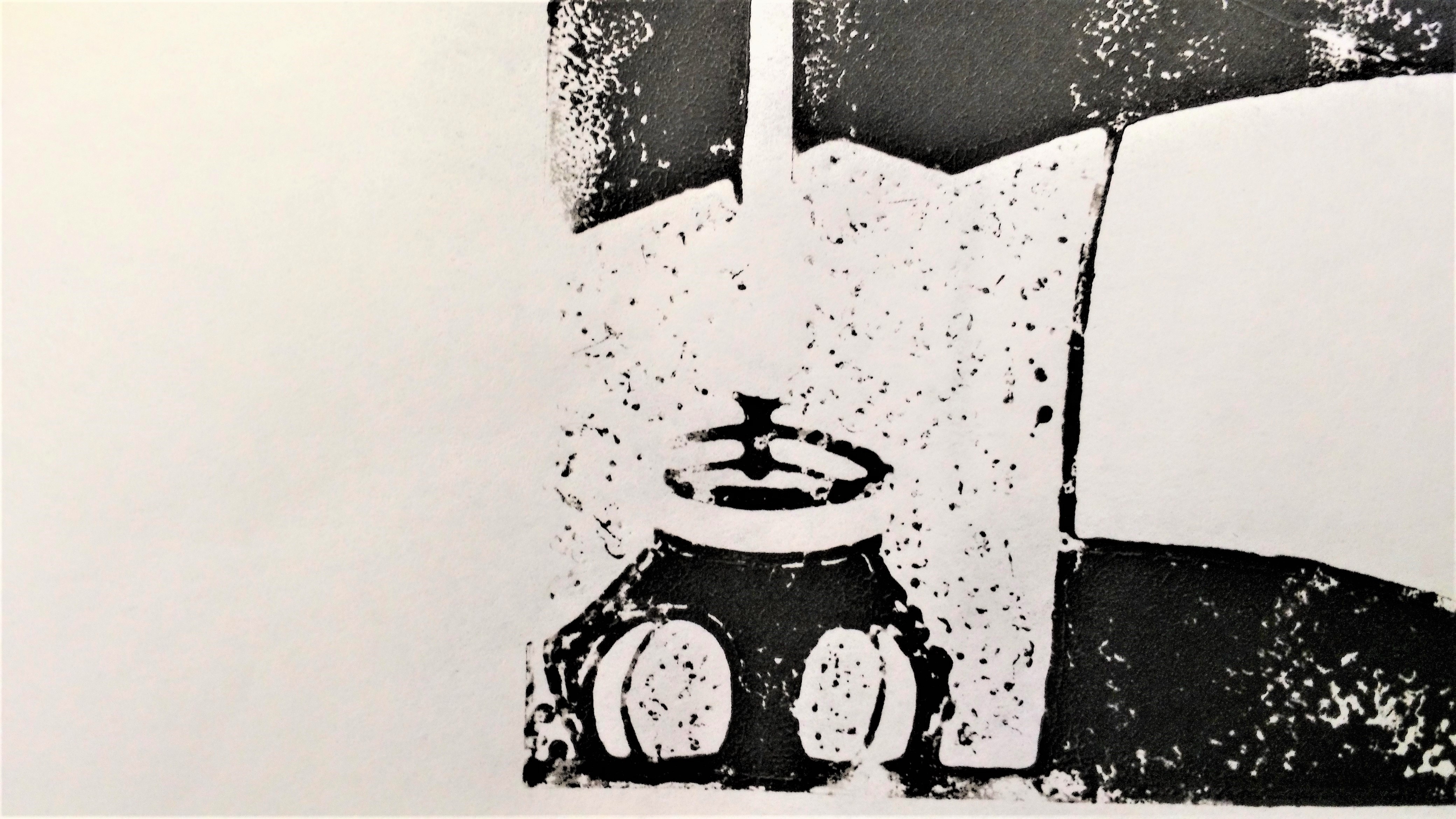
I learned some valuable and interesting lessons: first, the plate needed to be much larger. The reason the dots on the dress, for example, didn’t turn out well is that they were simply too small for the 3D printer’s extruder (a nozzle of sorts) to print precisely. Second, I found that tiny white spaces/shapes surrounded by black space (e.g. the thin white line) looked and printed much better than tiny black shapes surrounded by white space (e.g. the dots on the dress).
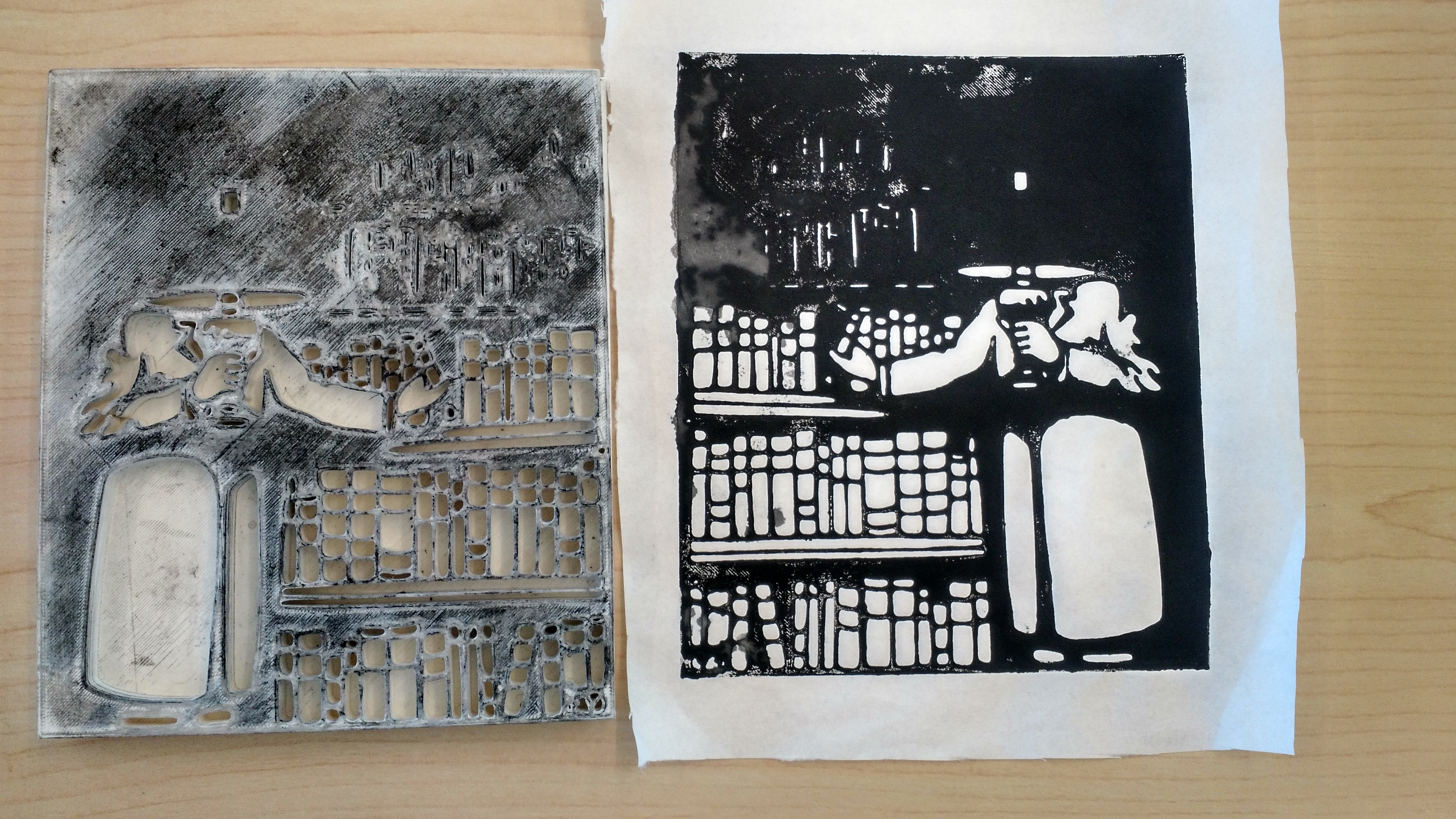
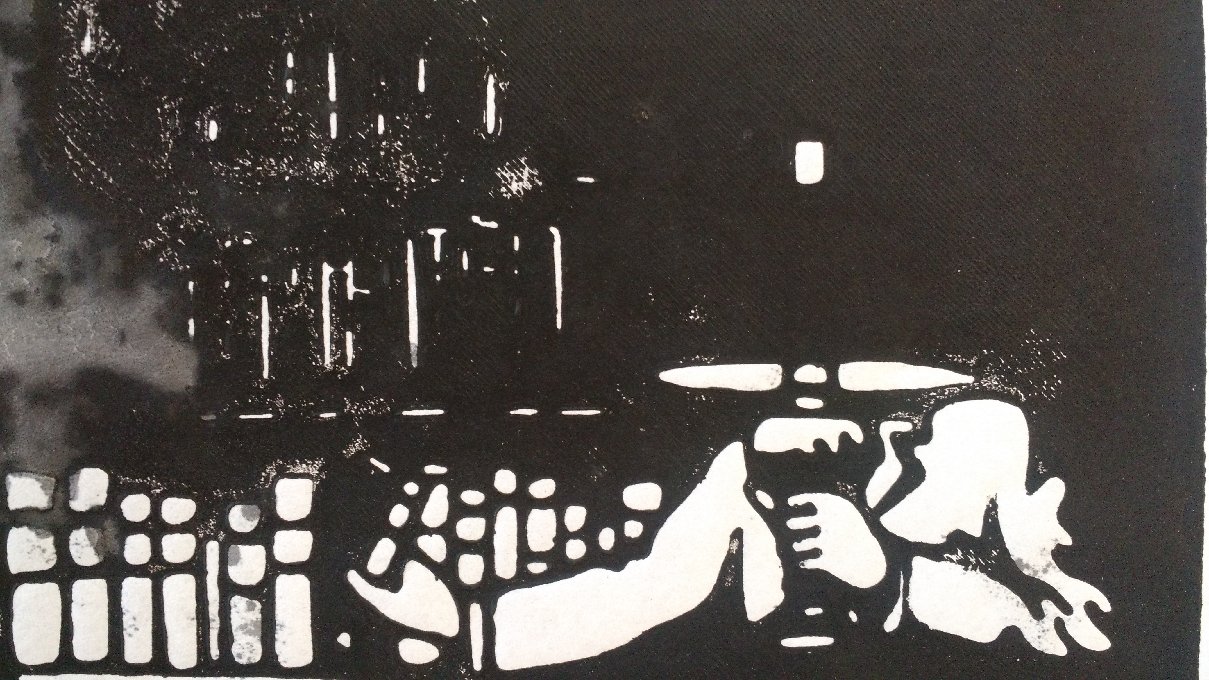
With this in mind, I picked a different image for my second try: “The Bibliophile” (1911) by Félix Edouard Vallotton.
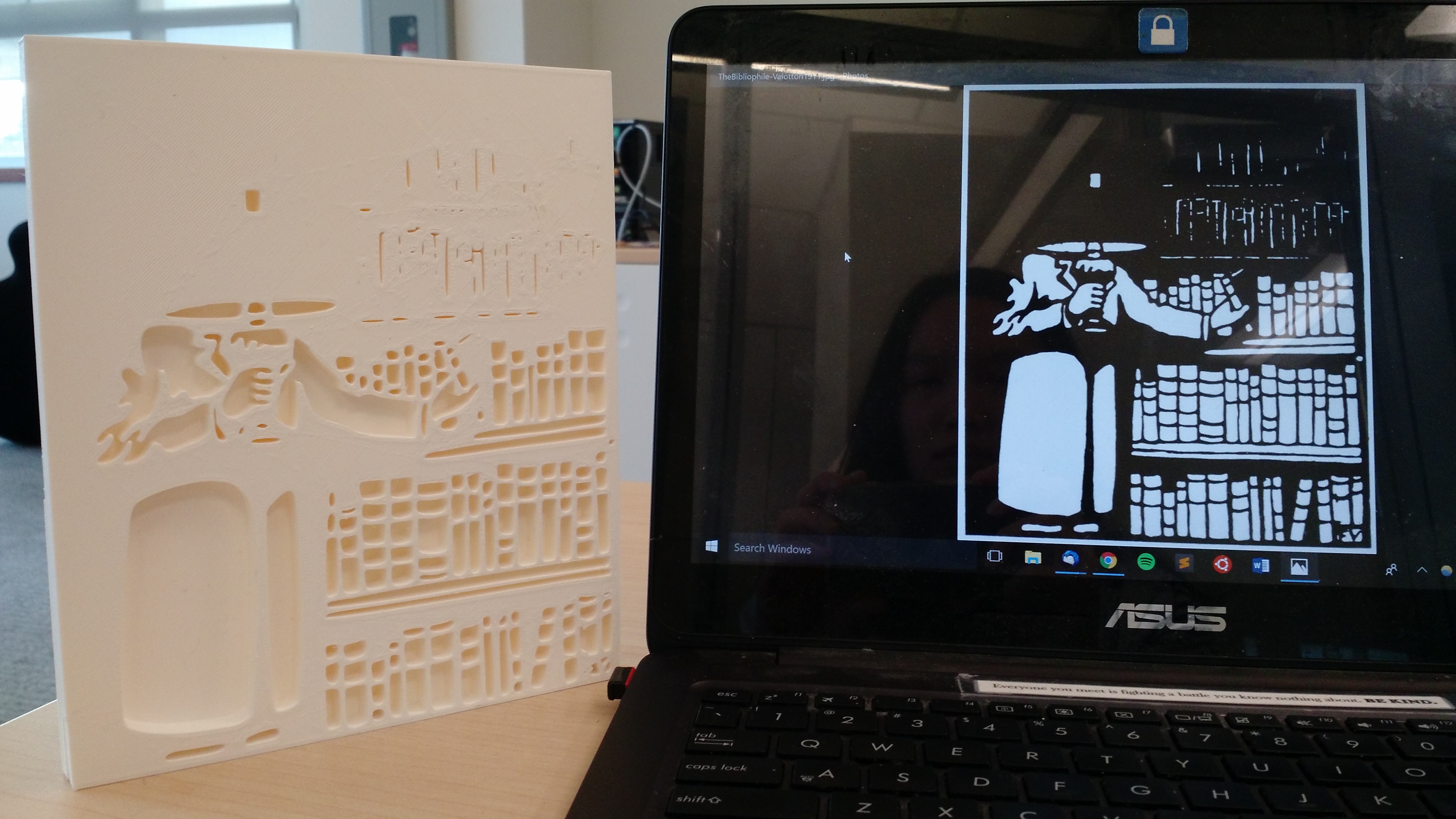
I designed the model to be much, much bigger–almost the entire width of the printer bed (for more about how a 3D printer works, see here). According to various tips on the internet, I decided to sand down the surface of the model. Usually, a model’s surface has very fine vertical lines from the way the extruder lays down the material.
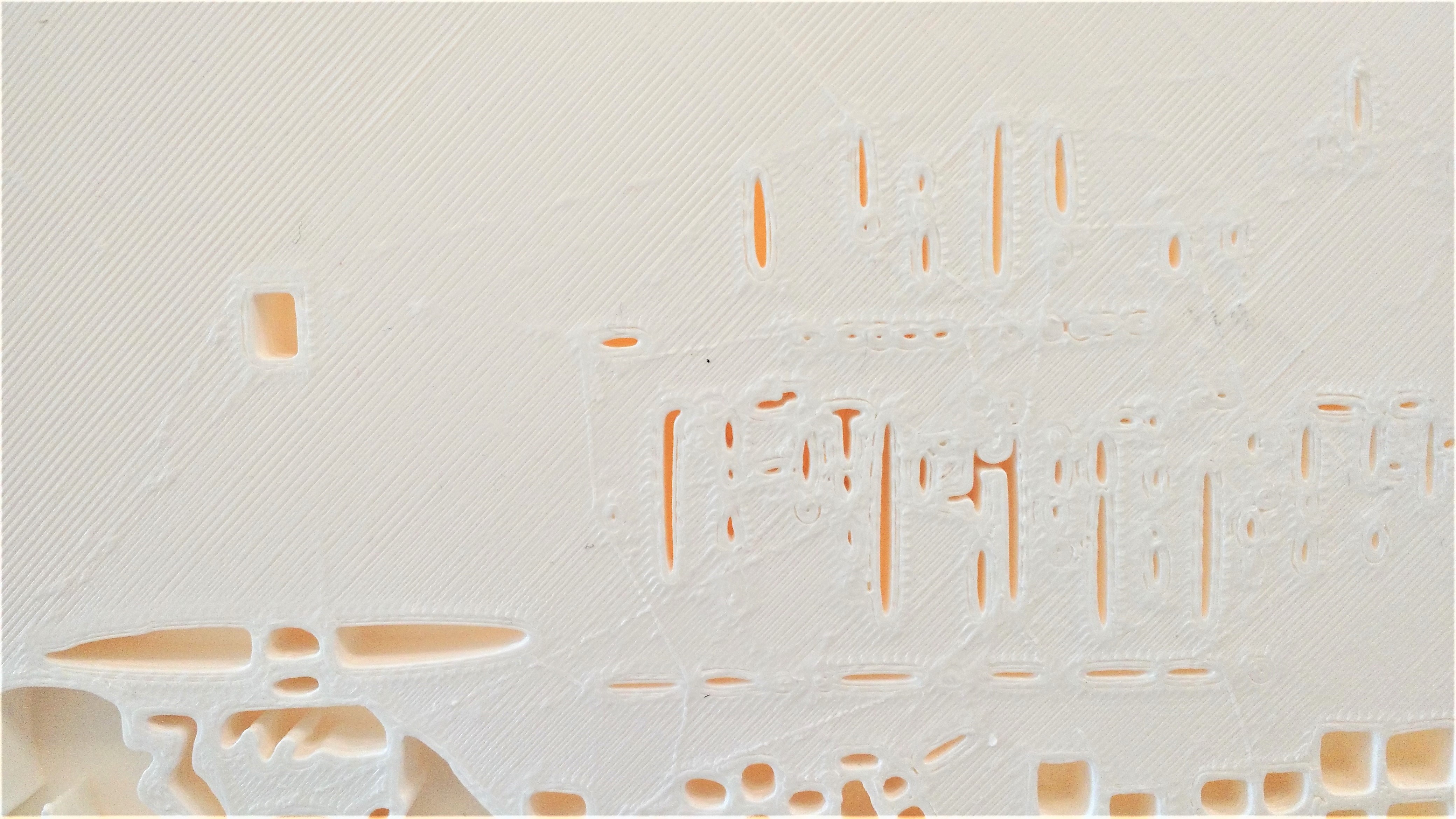
Oddly enough, I needed more pressure than before to get the ink to show (I’m not sure why this is). As I expected, the lines surrounding white or empty space printed much more cleanly.
Lessons Learned
For Pedagogy
We could think of the final product/process as a pedagogical tool: having a 3D model and a 2D image in hand can serve as a visual way to trace how this becomes that–a process that’s hard to imagine when described verbally. If we could model/print the same illustration two different ways (say in relief and intaglio), it could also help students better picture the differences between printing processes. 3D design demands a kind of spatial reasoning that humanities students may not be familiar with: what is the relationship between negative and positive space? How do we reconstruct the printing process without 3D artifacts to refer to? What are the affordances or limitations of a particular method or machine?
“Printing” Encompasses Several Processes and Materials
Remaking an illustration plate also gave me a better appreciation of the labour and difficulty involved in printing; There were so many variables involved, including the type of ink, pressure (how hard to push), type of paper, the stamping material, etc. that it’s clear why people in earlier centuries would have had to apprentice for many years. For example, when a print comes out sub-par, is it because ink doesn’t adhere very well to PLA (polylactic acid) plastic? Would a more malleable rubbery kind of plastic produce a better print? In other words, to echo Daniel C. Howe and A. Braxton Soderman, when you push on a material, the material pushes back. It resists you and does things you might not want or expect. This can be jarring since, nowadays, we expect images to be neat and clean.
Future Experiments
I’d like to try different inks (water-based vs. oil-based) and papers to see if that makes any difference. Some quick searches online also suggest a more flexible kind of plastic (such as Ninja Flex) or putting a rubbery mat underneath the paper might help. In future, I’d also like to try printing on an actual hand press. So far, I’ve been pressing with a tennis ball and so the coverage/pressure isn’t uniform, and so I might get more consistent results.
Acknowledgements: Thanks to Drs. Lisa Surridge, Mary Elizabeth, and Erin Kelly for lending me their materials and for general advice/suggestions. Thanks also to Dailyn Ramirez, Dani Johnson, and Rich McCue for their support.
[/et_pb_text][et_pb_post_nav prev_text=”%title” next_text=”%title” _builder_version=”4.4.7″ global_module=”4392″][/et_pb_post_nav][/et_pb_column][/et_pb_row][/et_pb_section]