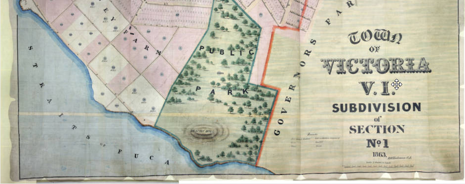
I am neither a map cataloger (one of several specialized areas within cataloging) nor a geographer, but one of the perks of my job is the opportunity to work with a huge variety of material, including maps, both historical and contemporary. Recently I have been able to help contribute to these projects through adding metadata (descriptive information) to the images. This work is not without challenges of course, so here are a few things I’ve run into.

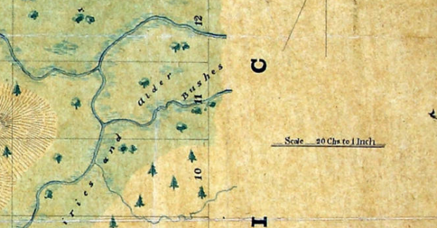
One of the biggest issues is scale. When you are dealing with a physical object a bar scale makes perfect sense. The item can be measured and you can use a bar scale (e.g. one inch equals one mile) and get a pretty good idea of the area covered or of the distance between two points on the map. Converting the bar scale to a ratio (e.g. 1:63,360) also allows users to understand the size. The next challenge may be in sorting out the math involved in comparing less common units of measurement such as leagues or chains — some of which can vary depending on context.

On a digital object, a scale is a curious holdover because the image can be resized on screen and because there is no way to manage how a user’s settings may influence the display of the material. There is a vast amount of conflicting debate right now over how best to represent this information with no clear standards yet to emerge. For those times when scale simply cannot be clearly determined or transformed into a ratio, we can use either “scale not given” or “scale not determined” and there are arguments that one or the other of those should always be used for digital maps. However, we made the decision to use the scale provided for the original physical object, where it is indicated, as we typically strive for accurate representation of the object.

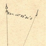
Sometimes, older maps use notations that are not easily interpreted, especially by non-geographers. One of these notations is the way magnetic declination (aka magnetic variation) is indicated. Usually represented by crossed lines (one pointing to true north and one to magnetic north) and often listed in degrees and minutes. On older maps, this notation was inconsistent and sometimes cryptic, as with this example, which reads “Variatn 23° 30′ E” and I interpreted as “Variation 23 degrees 30 minutes East.” In this case, I sent the image to the maps librarian with my suspicion and he confirmed that this did look like magnetic declination — a good thing to know historically since it does vary over time and by location.
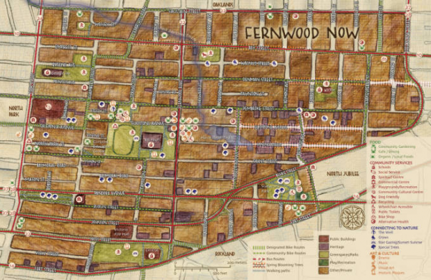
While historical maps can sometimes include scant or unreadable information, contemporary maps can offer the opposite problem. While working on some of the maps from the Community Mapping Project — items that were born digital, but also printed — we had to make a difficult call on how much information to include. In particular the list of contributors included, in several cases, over 30 individuals and organizations. The compromise in this case was to earmark the maps for OCR later, which would capture all of the information in a transcript that will be fully searchable.

You can explore our growing collection of maps through the Historical Cartographic Collections and the Community Mapping Project.