
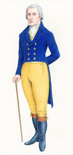
[et_pb_section fb_built=”1″ _builder_version=”3.22″][et_pb_row _builder_version=”3.25″ background_size=”initial” background_position=”top_left” background_repeat=”repeat”][et_pb_column type=”4_4″ _builder_version=”3.25″ custom_padding=”|||” custom_padding__hover=”|||”][et_pb_text _builder_version=”3.27.4″ background_size=”initial” background_position=”top_left” background_repeat=”repeat”]About a year ago, A new portrait was unveiled of Mr. Darcy, one of the main characters in my favourite novel, Jane Austen’s Pride and Prejudice. The portrait depicts Mr. Darcy in a blue coat with beige breeches, and–most shockingly for modern Austenites–long, straight, powdered hair.
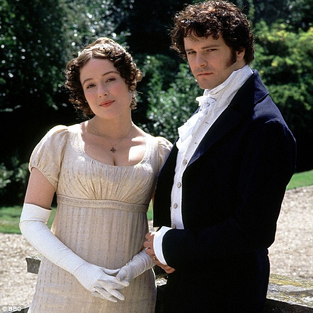
This distinctively eighteenth-century Mr. Darcy looks very different from the vision we are familiar with through illustrations and dramatic adaptations of a much broodier Darcy with short dark hair and dark clothing, epitomized by Colin Firth’s portrayal in the 1995 BBC miniseries adaptation of the novel. When I started learning to use a visual comparison tool called Juxtapose JS, I realized this was an excellent application of the tool to compare different visualizations of the character side by side.
The new portrait of Darcy was illustrated by Nick Hardcastle and developed by Amanda Vickery, a professor of early modern history at Queen Mary University, and John Sutherland, a professor emeritus of Modern English literature at University College London. Their argument is based on the time of the novel’s writing. As Vickery explains,
“As Austen wrote Pride and Prejudice in the 1790s, our Mr Darcy portrayal reflects the male physique and common features at the time. Men sported powdered hair, had narrow jaws and muscular, defined legs were considered very attractive. A stark contrast to the chiselled, dark, brooding Colin Firth portrayal we associate the character with today.” (“Researchers piece together”)
The manuscript that Vickers refers to was called First Impressions, and was begun between fall 1796 and summer 1797 (Mandal 44). Austen made substantial revisions to this manuscript between fall 1811 and fall 1813, transforming it into Pride and Prejudice (Mandal 50). So, Although Vickery is correct that the life of the novel began in the 1790s, the final version of the novel is a product of the 1810s. Evidence within the novel suggests that it is set in 1811-1812, not in the 1790s (Mandal 51). Twenty years may not seem like a significant span of time, especially compared to the 200 years that separates the novel’s historical moment from our own, but the years between 1790 and 1810 were years of revolution, marked by political, social, economic, and cultural upheavals, all of which manifested in a drastic change in men’s fashion. The brightly-coloured clothes and powdered hair that was in style in Britain in the early 1790s seemed old-fashioned and dangerously French by the 1810s.
Regency Britain is better known for men of fashion like Beau Brummel and Lord Byron, both of whom are much closer in looks to the Firthian Darcy than the Hardcastle portrait.

Teri Campbell has written about how Austen may have imagined Jane and Elizabeth Bennet to look, and she notes that Austen looked for a suitable portrait of the characters at exhibitions of Joshua Reynolds’ paintings that she attended in 1813, lending more support to the idea that the novel is set in the 1810s (Campbell 210). We can also use Juxtapose to see how well the two versions of Mr. Darcy align with the fashions of the two decades.
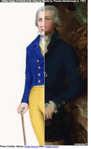
The first Juxtapose I created shows the full-length Hardcastle portrait of Mr. Darcy alongside a portrait of Sir Robert Brooke by Thomas Gainsborough, painted around 1781. Gainsborough was a very popular portrait artist of the late eighteenth-century, and this painting of Brooke is strikingly similar to Hardcastle’s vision of Darcy. The purpose of this image is to show how similar the Hardcastle portrait is to this image of a fashionable gentleman of the late eighteenth century.
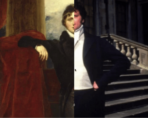
The second Juxtapose I created shows an image of Colin Firth as Mr. Darcy alongside a portrait of Lord Granville Leveson-Gower, by Thomas Lawrence. Lawrence was a very popular portraitist of the Regency period. The purpose of this Juxtapose is to show how similar the Firthian Darcy is to to this image of a fashionable English gentleman in the early nineteenth century.
Finding appropriate images with enough visual similarities to make the Juxtapose meaningful is challenging, and editing the images so that they align properly can be frustrating. In both, the images are not perfectly aligned, for instance, in spite of my spending rather too much time tinkering with the them. Another potential issue is that Juxtapose images can be shared by URL, but doing so enlarges the images in a way that cannot be controlled. My images look fuzzy as a result. It is possible to embed the Juxtapose images using iframes, which eliminates this problem. (Since this blog platform doesn’t allow WordPress’s iframe plugin, I’ve created gifs of the original Juxtapose comparisons in action to include in this post.)
This example demonstrates, though, one possible application of Juxtapose for digital scholarship. In my experience studying book illustrations and in the research I did for this project, I have learned that visuality is one area of literary studies particularly well suited for digital scholarship. Juxtapose, for example, makes it possible to show comparisons of images rather than describing them.
Works Cited
Campbell, Teri. “Not Handsome Enough”: Faces, Pictures, and Language in Pride and Prejudice.” Persuasions, vol. 34, 2012. Gale Literature Resource Center, pp. 207-221.
Mandal, Anthony. “Composition and Publication.” The Cambridge Guide to Pride and Prejudice, edited by Janet Todd, Cambridge University Press, 2013, pp. 42-55.
“Researchers piece together a portrait of the real Mr Darcy,” Queen Mary University of London, 10 February 2017. http://www.qmul.ac.uk/media/news/items/hss/192276.html
[/et_pb_text][et_pb_post_nav prev_text=”%title” next_text=”%title” _builder_version=”4.4.7″ global_module=”4392″][/et_pb_post_nav][/et_pb_column][/et_pb_row][/et_pb_section]