
[et_pb_section fb_built=”1″ _builder_version=”3.22″][et_pb_row _builder_version=”3.25″ background_size=”initial” background_position=”top_left” background_repeat=”repeat”][et_pb_column type=”4_4″ _builder_version=”3.25″ custom_padding=”|||” custom_padding__hover=”|||”][et_pb_text _builder_version=”3.27.4″ background_size=”initial” background_position=”top_left” background_repeat=”repeat”]Have you ever wanted to “see” data in order to understand or communicate it better? Google Fusion Tables can help you do that!
Fusion Tables is an experimental data visualization web application to gather, visualize, and share data tables. You can import your own data sets from spreadsheets or data tables from open data repositories and visualize them immediately on a map or chart, and share them.
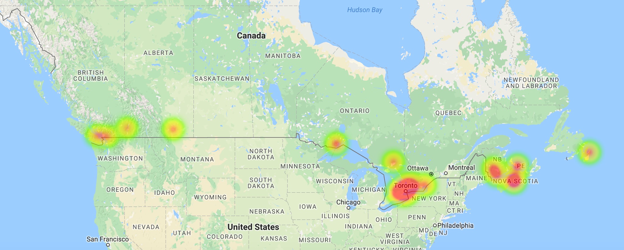
This intensity map created on Google Fusion Tables showcases cities across Canada where the term “anxiety” has been Googled the most over the past five years. Large amounts of red represent more searches. For example, searching “anxiety” is more frequent in cities in Ontario than BC.
Data visualization can help you identify patterns and trends, understand concepts, and communicate data in a creative way!
If you’re interested in learning more about Google Fusion Tables, be sure to check out our data visualization workshops that is coming soon: https://oac.uvic.ca/dsc/workshops/
[/et_pb_text][et_pb_post_nav prev_text=”%title” next_text=”%title” _builder_version=”4.4.7″ global_module=”4392″][/et_pb_post_nav][/et_pb_column][/et_pb_row][/et_pb_section]