
A Critical Reflection on Technology Used in Tram Fair?
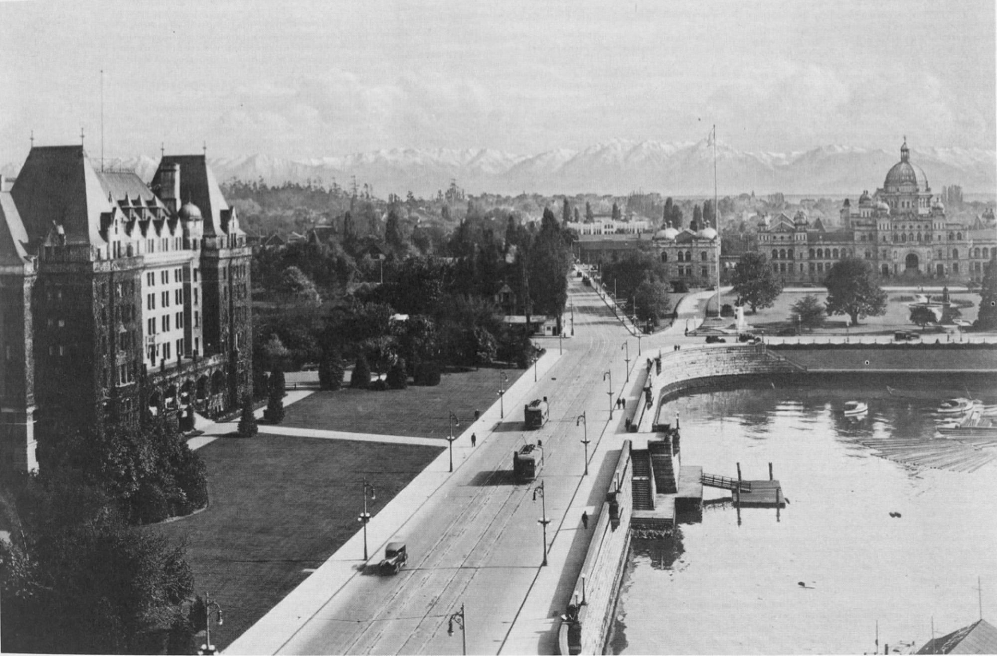
To create our finished historical map, aspects of many different softwares were used and brought together. First, historical maps were georectified using Map Warper and exported as a TIFF file (Tagged Image File Format). They were then uploaded to Map Box, which converted the file to a raster tile layer. In this form, they could then be integrated as a tile layer into ArcGIS online. It was in this final web mapping application that we could begin to add further customized visualization as well as geolocated census directory data compiled in Google Fusion Tables. Occupations were selected from the 1892 and 1902 Victoria directories based on what occupations were deemed to represent “blue-collar” professions. These occupations were compiled into a spreadsheet and a website used to match addresses to their coordinates on the map in order to upload the spreadsheet to Google Fusion Tables and represent the distribution of working class people in Victoria on a map. This method has a number of issues. The occupations that were included in the spreadsheet were chosen based on a qualitative analysis of what employments represented working class and does not, therefore, offer an exhaustive list of all working class people in Victoria and their addresses. Furthermore, the addresses given for some individuals in the directory were sometimes incomplete or no longer extant. These issues mean that the distribution of working class people in Victoria as represented in our Google Fusion Tables map should not be taken as definitive. Rather, our research gestures towards an understanding of the spaces in which working class people lived in 1892 and 1902 without providing a final answer to that question. It is, however, sufficient to serve the purposes of our research as a rough guide to the class makeup of turn of the century Victoria.
For our project, we wanted to emphasize polyphony, or a multitude of voices and perspectives throughout time, space, and class. ArcGIS allowed us to highlight areas and regions, as well as add clickable points where the various stories could be seen in place. It also allowed us to portray these stories as part of their spatial relationship to the streetcar networks and class in Victorian society. Infrastructure development and its relationship to class structure can be complex and multifaceted, and we needed a tool to visually connect and compare the many layers. The downside to all of the above tools mentioned is that though they are free to use, the caveat is that they must be published to the public. While this was not problematic for our particular project, it may become as issue if working with sensitive material or vulnerable groups, such as homeless populations or First Nations.
Another tool we used was building a website with WordPress. For us, this was important in order to provide an wider explanation, context, and resources surrounding our historical map, with the understanding that cartography can often hide more than it reveals. This would provide the reader the opportunity to “look beyond the map” at our research so as to not see the map as a scientific product, but rather as a thesis, and give them the opportunity to challenge our assumptions and biases. Even so, the nature of digital technology, which represents all its information in the form of binary, is to slide towards scientific pretensions. It is difficult to give the impression that knowledge is fluid when data is arrayed on a point-map or in other medium. The inclusion of text permits an important intervention: while text by itself is equally domineering in its claim to have hold exclusive knowledge on a topic, the inclusion of written text is important in explaining the holes in the methods which produced the technological representations. Technology aside, this work is not conclusive.