

The University of Victoria’s University Systems is in pursuit of making it easier for our user community to access their info, when, where, and how they choose to study or work.
Author: Faye Hoffman (Sr. Information Architect & Usability Specialist at UVic)
“Designing for mobile first not only prepares you for the explosive growth and new opportunities on the mobile internet, it forces you to focus and enables you to innovate in ways you previously couldn’t.” ~ Mobile First by Luke Wroblewski
When we think of Mobile Design more often than not the image of a mobile device pops into our head. Whereas, if we think of the users first we reveal the fundamental challenge of designing for the mobile experience. Adopting a mobile first design strategy supports our user community.
Mobile Usage and Higher Education Web Trends
For today’s tech-savvy students, mobile technology is their chief information source and they have high expectations of what a digital experience should offer. Technology is a key player now in decision-making by students. An institution that shows it doesn’t understand technology is indicating that it won’t help student’s prepare for the future.
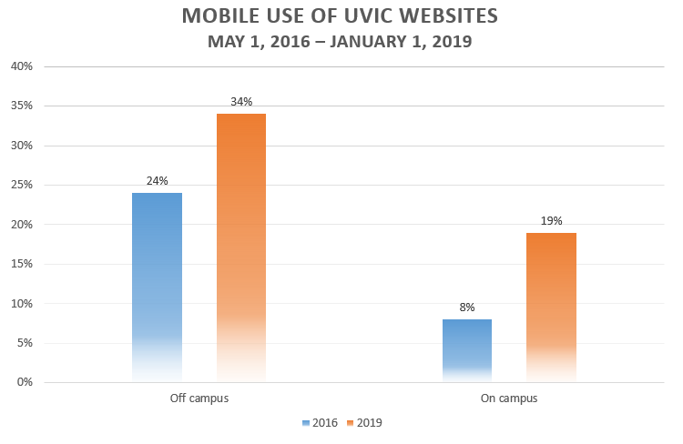
UVic web technology statistics identified that between May 1, 2016 and January 31, 2019 the use of mobile devices to access UVic web sites has increased significantly:
The uptake in use of mobile devices is not unique to universities nor is the growing trend of companies and institutions which are moving from a desktop-focused design strategy to a mobile-first one.
According to a competitive analysis of the mobile experience of 34 universities by UVic’s University Communications + Marketing department in 2018, 33 use a responsive design solution.
Same But Different
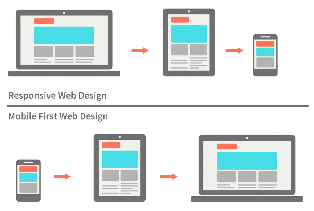
Mobile first and responsive design aim to provide a useful and usable user experience (UX)for users with different size of devices. However, mobile first and responsive design utilize different approaches. Mobile first focuses on the critical information and tasks to be displayed and supported on very small screens and builds up to larger screens. Responsive design starts by designing for the desktop and is adapted for smaller screens.
Mobile users are always on the move, so it’s not just about how easy their UX is but how well it fits into their situation – time, location and goal. Mobile first allows for personal and adaptive interaction with content where and when it is needed and convenient. Designers are forced to work within the inherent constraints of mobile devices (small screens, awkward input, gestures and touch, divided attention etc.) and to be more innovative with the new capabilities these devices bring to the UX. The goal of the UX professional is to design systems which fulfill the user’s needs whether they use them at home or on the bus, whether on a phone, tablet or desktop computer.
“As a millennial college student, I very rarely let go of my smartphone. It is no longer just a device for communication.” ~ Lauren Pollito, DePaul University student
Key UX Design Principles
Generally, key UX design principles remain the same when utilizing a mobile first approach:
1. Early focus on users and tasks
- Define user characteristics
- Observe users doing their normal tasks
2. Empirical measurement
- Test with users
- Start by testing “printed scenarios”
- Proceed to test prototypes
3. Iterative design
- Design – Test – Measure – Redesign for as many cycles as needed
Source: Jacob Nielsen, The Immutable Rules of UX
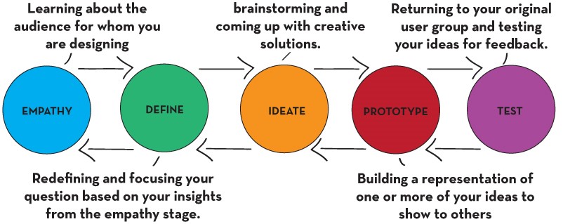
Core UX Design Activities
The core activities involved in UX design such as learning about user goals, brainstorming creative solutions and building and testing prototypes for mobile aren’t that different from a desktop project. It’s when we get down to specifics such as organization, actions, inputs and layout that we need to consider the constraints and capabilities of mobile devices (which is a call for another blog post).
The Importance of Identifying and Prioritizing User Features
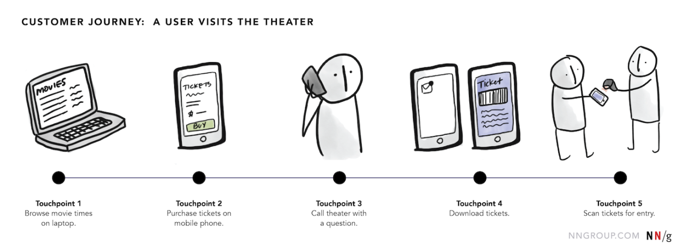
When we design for the mobile UX, we need to do user research to uncover the goals, behaviors, motivations, and contexts of our customers through ethnography, observations, interviews, market research, task analysis and modelling our systems to user’s behaviour. We need to understand the user flow from end to end; the key user pathways or journeys, including the pain points along the way. Context plays an important role because different devices are utilized in different circumstances and times of the day, for varying lengths of time or focus. Additionally, different devices are better suited to specific types of user tasks. For example, watching movie trailers on a laptop computer at home and then scanning your purchased tickets at the theatre.
In contrast to responsive design which consists of miniaturizing a system; cutting features and functionality from a desktop system and wedging it onto a mobile device, a mobile first strategy may even mean adding features and functionality to better accommodate the needs of the mobile user.
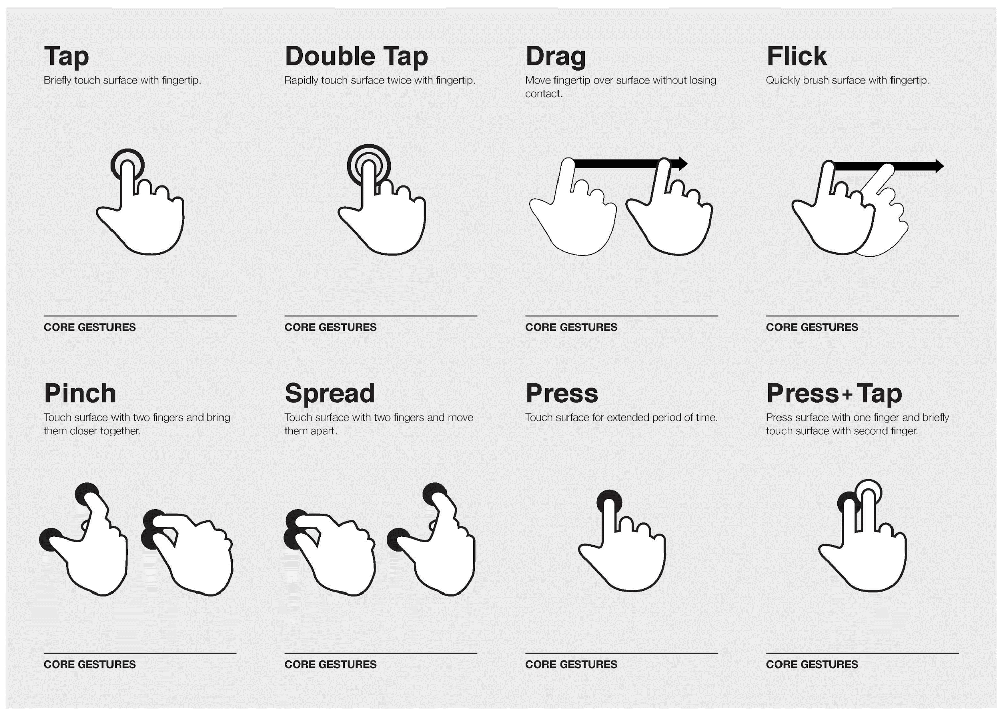
Some solutions may be used more on the go (maps, phone directories) and some are used more inside the house (entertainment). What is created should leverage the extra capabilities of mobile devices to the advantage of the user and limit or mitigate the drawbacks of a smaller screen and limited processing power. For example, real-time GPS and touch gestures.
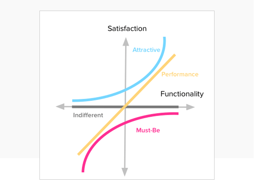
To design a successful user-centered system, it is critical to use tools such as the Kano Model to prioritize features of the highest importance and strip away everything that would distract users from what’s important (such as superfluous decorative elements). Every element in a mobile UX design, whether a navigation system or an image or copy, should have a purpose; it shouldn’t be included unless it’s necessary to the user’s tasks.
It Begins and Ends With the User
Information architecture in a mobile first environment is not much different than for the desktop but it does require the designer to embrace new contexts, capabilities and limitations. What is critical is maintaining the focus on user research and prioritization necessary for designing a truly exceptional mobile user experience.
References and Recommended Resources
- Designing the Mobile User Experience, Human Factors International
- Information Architecture Institute
- Mobile First, Luke Wroblewski
- Mobile Usability, Jakob Nielsen and Raluca Budiu
- 5 Apps Educators Should Use in Their Classrooms by Lauren Polito
- Millennials are top smartphone users, The Nielsen Company
- What is Mobile First Design? Why It’s Important & How To Make It? By Vincent Xia
_______________________
 Faye Hoffman has over 20 years of experience as an information architect in Victoria, Vancouver, Colorado, and Utah. She received a Bachelor of Design in Communication Design from Nova Scotia College of Art and Design and an Honours Diploma in Fine Art, Painting from Emily Carr College of Art and Design. She is also an artist, active in the local arts community in Victoria.
What an informative and well-written article, Faye! Thank you so much for clarifying what mobile first means. I also now understand this is an upward trend which we should embrace and incorporate into our cultural mindset. Well done!
I am excited for this redesign and the improvements to usability! The amount of research and strategy that has gone into this project is fantastic.
Great post Faye! Thanks for sharing the differences between mobile first and responsive design. Very informative.